Seeking the Story Behind the NSNC Logo
By Sheila Moss, NSNC Web Editor
With contribution by Jonathan Nicholas, NSNC President, ’96-’97
 Have you ever wondered about the NSNC logo? What is it anyhow and where did it come from? A few people have voiced strongly negative feelings about “the head,” while others find it curiously interesting, a bit mysterious, somewhat like the Mona Lisa. Those who detest it, however, claim it is more akin to Picasso’s madness than DaVinci’s genius.
In 2004, according to sources, Dave Lieber attempted to have the logo changed while preparing for the Texas conference. But due to lack of response, the membership undoubtedly being more concerned about preparations for the hospitality suite; the logo retained its status.
When contacted, Lieber suggested that we might get the logo’s history from Bill Tammeus since he was president of the Board at the time it was instituted. Tammeus, however, declined comment, claiming he was traveling in Poland. We imagine he did not want to start an international incident. He then neatly passed the proverbial buck to Jonathan Nicholas, another past president.
Nicholas obliged to inquiries to the best of his recollection, and this is the story he told:
* * * * *
Way back in prehistory, this would be about 1989, the annual convention — yes, it was a convention back then, not a “conference” — was held in a men’s club somewhere in the Midwest. There was lots of drinking. Lots of cigar smoking. Lots of profanity. Sounds a lot [similar to] a Tuesday at Bill O’Reilly’s house, right?
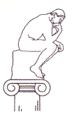
A few us decided, however, that something was missing from this happy throng. Women. So, the following year, not only did we sneak some in, we actually elected them to office. Next thing we knew these bra burners were tearing down every plinth of our sanctum sanctorum. Including, of course, the one upon which our logo sat.
We thought about tossing aside that poor naked thinker on his column, but then we had a second, much better thought. Why not get him a companion. Next thing we knew we had two logos. Both naked, both thinking columnistically, one rather curvier than the other. This lasted a while — they looked very happy facing each other across our letterhead until some other knave — can it really have been me? — decided we needed an upgrade.
Something a little more polished.
Something a little more professional.
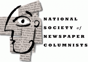
I went to some of the folks I knew here in Portland who were doing such landmark ad work for Nike and asked for some help. What emerged was the current logo. This is not some Photoshop creation.
We (very artfully) sketched the carefully androgynous head, shredded bits and bobs of newspaper columnists, tied them all together in a 3-D collage then photographed them to get that subtle shading. We thought this might keep the society quiet for a year or two.
He/She has been proudly waving our flag ever since.
* * * * *
Nicholas fondly dubbed the head “Alex,” even though others have less fondly dubbed it with other words. Alex was embellished with a graduation hat at some point and became a scholarly symbol for the NSNC Education Foundation. At the Philadelphia convention a more stylish version of Alex made a debut thanks to former NSNC conference chair Stu Bykofsky and his graphics consultant.
Through the years the logo has appeared in various sizes and colors on all sorts of official NSNC publications and other promotional materials of the organization, as well as in the Columnist Newsletter and, the Columnists.com Web site.
So there you have it, the story of the NSNC logo.
How do you feel about our logo? Love it? Hate it? Want to marry it? Do you suggest we tar and feather it? Send it to Iraq? Hang it in effigy? Let terrorists hold it hostage? Should we place it in a museum? Let O’Reilly interview it? Run it for a political office?
It spite of its continuous, animated chattering, “the head” has never expressed an opinion one way or another and seems to prefer leaving the words to the columnists.
__________________________
More Logo Trivia
Bob Haught, long-time NSNC member and former board member serving in various offices, had an interesting story to add to the trivia about our NSNC logo.
* * * * *
When I was editor of The Columnist (in the early years of this century), I was confronted regularly with the distinctive NSNC logo. One day when I stared intently at the image, searching for inspiration or an idea, I suddenly became aware of two faces: a pleasant, smiling profile on the left, a grumpy, frowning one on the right. I used the two faces to create a comic strip about Col and Lum, for the newsletter.
* * * * *
So… it seems our logo has multiple personality disorder. Since most of us probably see Col first, we have attempted to reveal the elusive Lum, the dual psyche.
Originally published Sept. 18, 2007


